UX Design
The Design Process: Analysis
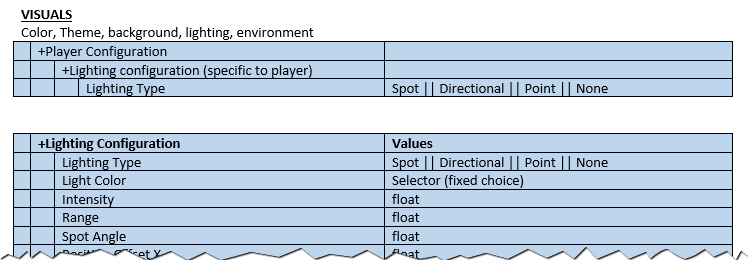
For this design project, we were building a 2D Platform runner with level editing capabilities. To begin the analysis stage I reviewed the currently implemented level-editing features (over 80 of them), breaking them into high-level categories (such as visuals, behaviours, and control). I spent time learning about each feature and organized them as they were implemented. Here is a sample snapshot.
From here, I began researching our target audience and developed personas that were relevant. Our focus was on children, ages 10-12, who would have access only to inexpensive phones, and would play the game while in the back seat of the car, or when their parents would not want to be disturbed.
In the analysis stage, we look thoroughly at our target audience, at the devices we will target, and at the platforms that will be available. We look closely at the restrictions of the hardware and software. We were designing the game in Unity 3D so we needed to carefully examine the capabilities of that particular game engine.
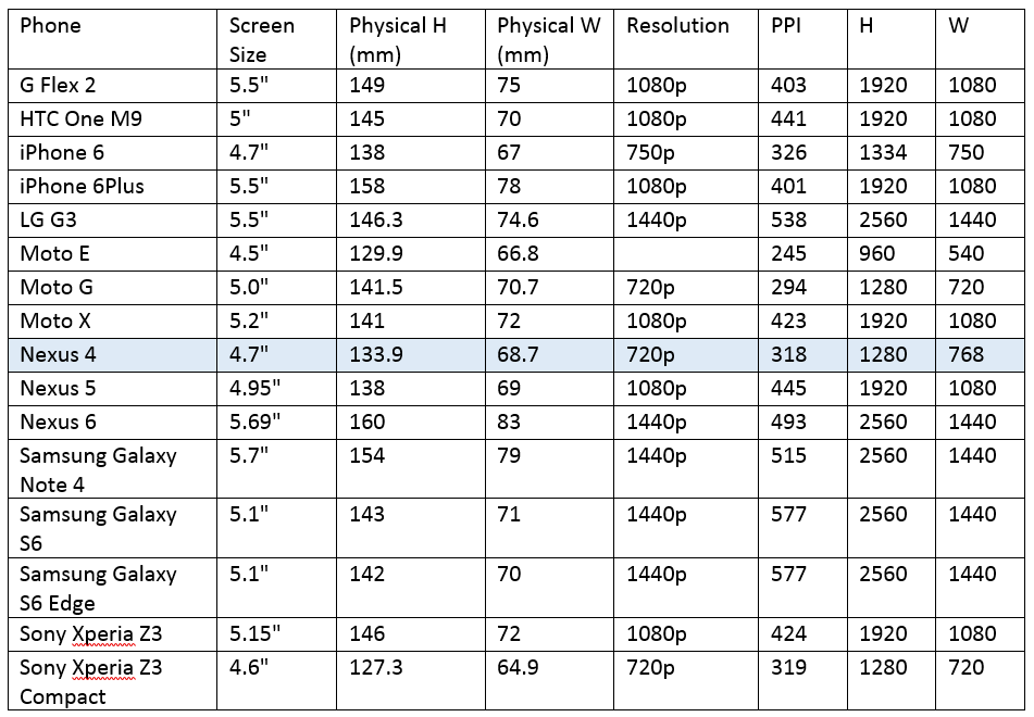
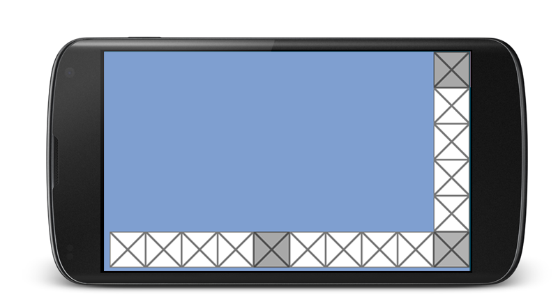
All of the designs are aimed at a Nexus 4 screen size (1280 x 768). We felt that this best represented our key demographic (kids riding in the back of the car and mom gives them a cheap phone to play on).
We then researched the minimum button size required for finger interaction. We determined the best minimum button size for finger interaction should be 10mm x 10mm. This is based on the following:
- Average fingertip is 8-10mm wide
- Average finger pad (flat part of the finger) is 10-14mm wide
- Minimum target size for finger is 7x7mm (with 1mm gap that can also be interactive)
- Minimum target size for the thumb is 8x8mm (with 2mm gap)
- People are generally good at rotating their hands to minimize occlusion.
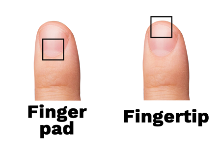
A button the size of 10mm x 10mm gives it the minimum size for a thumb to use, where a finger can also be used if the thumb is too big. Since our target audience is children this size should be adequate. After checking other games we found their button sizes to be smaller.
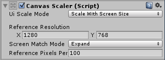
All the UI was designed in reference to the Nexus 4. Therefore, the following settings should be used in Unity to maintain the proper sizing.
Ui Scale Mode: Scale with Screen Size
Reference Resolution: 1280 x 768 (Nexus 4)
Screen Match Mode: Expand
Reference Pixels Per: 100
Using the Unity settings above, the minimum size for a 10mm x 10mm button on the Nexus 4 is: 126px by 126px.

This allows us to use a maximum of 10 icons wide and 6 icons high.
This was just a sampling of the analysis that we went into for this project, but it should give you an idea of the analysis stage for UX Design.