UX Design
The Design Process: Medium‑Fidelity Prototyping
Medium-fidelity prototypes are all about preparing something representative to get feedback from other individuals. You get better responses from individuals if they are able to interact with what you are showing them. This way, you can help reduce the bias (they can just figure out how to do stuff on their own). This is not the final version, it might not even be very polished, but you want to get feedback before you tackle something as time-consuming as implementation.
Some UX developers will argue that if you can implement it fast enough, then implementation is sufficient for testing your ideas. While this is true to some extent, I (and other UX Designers) favour quick prototypes. A lot of designers I talk to use programs such as PowerPoint or Keynote to create their interactive prototypes. I prefer to use Axure myself, but whatever tool you choose should allow you to quickly create and alter. You do not want to spend hours (or days) creating something only to have it completely scrapped (which is, and should be, a possibility at this level).
Medium-fidelity prototypes should be about showing your designs to colleagues and getting important feedback. If you are a UX Developer, you would then look into turning that feedback into an implementation. If you are a UX Designer, then you should look at refining those designs. Depending on how big of a change you make, might require you to go back and re-evaluate your future alterations.
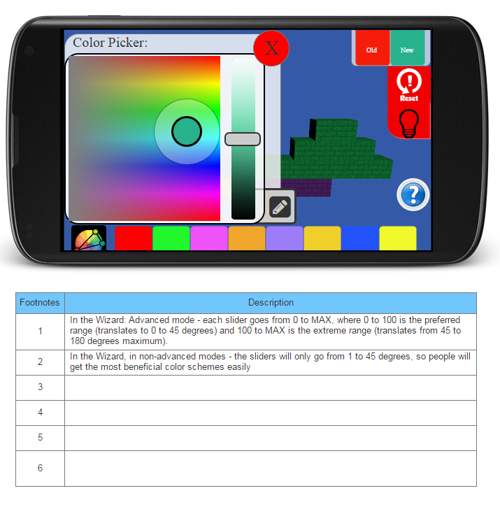
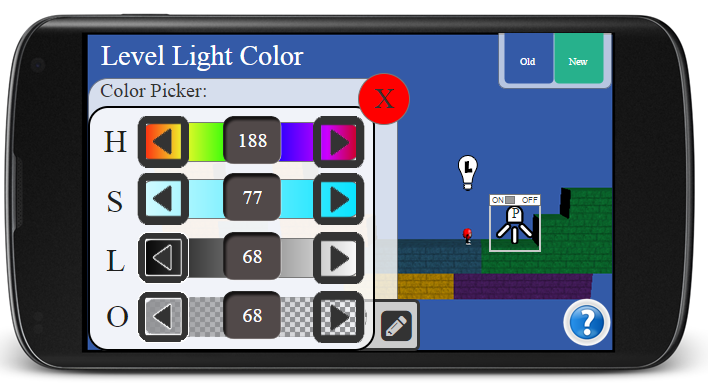
With the color-picker we had a variety of issues to solve, we needed a way to select an individual color for one of 8 blocks, we needed a wizard to choose compatible colors automatically, we needed to be able to see the colors without the custom light settings, we needed a way to revert to the old color, and so on.
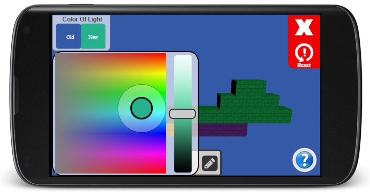
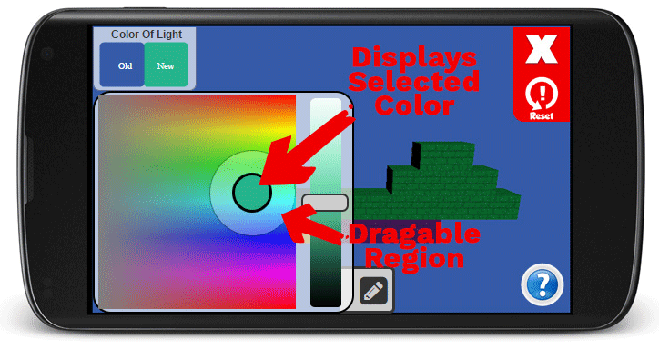
We compared what the color-picker would look like when using fine variations or when using it for changing the color of the lighting.
We tried simpler versions, in this example the center of the circle would fill with the color currently selected. The user could grab the edge of the circle to move it around in the color space. The slider controlled the saturation.
Clicking on the pencil icon would take the user to the precise entering screen, where they could input exact values for Hue, Saturation, Lightness, and Opacity (not available on the default screen). Touching the arrows to either side would increment the value by one.
Even a feature as simple as a color-picker went through many iterations. We needed to consider: how much space was available for the user to pick the color, was the layout consistent with other pages, can the individual undo his change, is the way to apply the change obvious, what else needs to be present on the screen, etc.
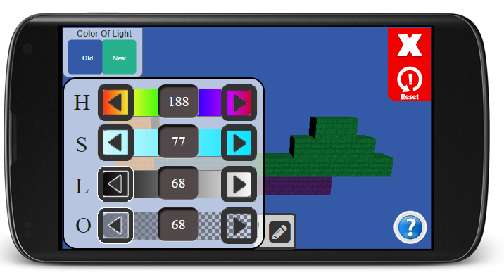
After many iterations, we decided to implement the option below. This is where we took our design decision to our high-fidelity prototype, or our implementation.